As soon as the pavilions at Architect’25 were unveiled, one design that immediately captivated onlookers was this unique, futuristic structure—one that seems like it’s been pulled straight from a sci-fi movie.
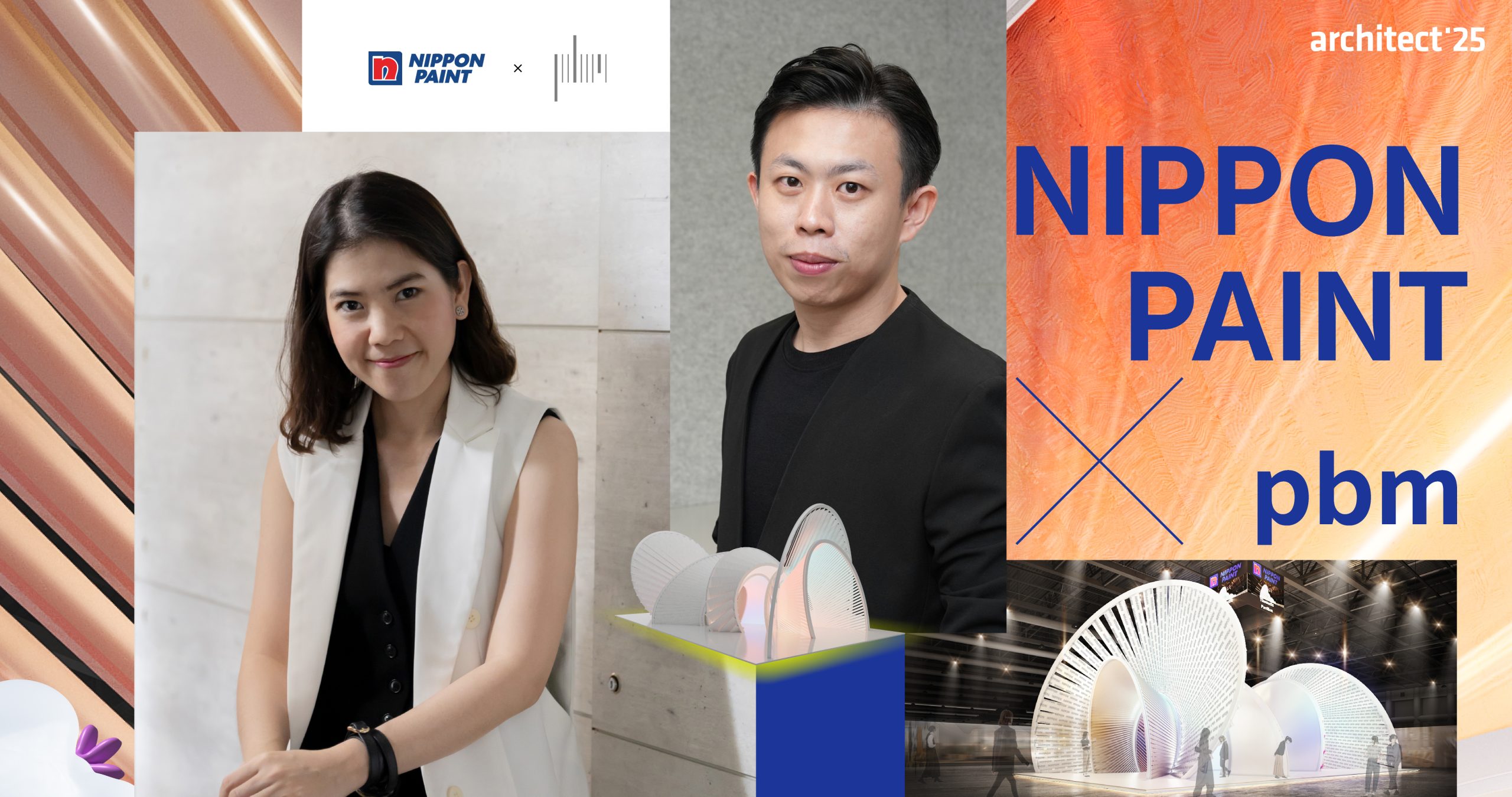
This Thematic Pavilion is a cutting-edge creation born from the collaboration between two creative forces: Nippon Paint, Asia’s No.1 paint brand for nearly a decade, and pbm, an award-winning architectural design studio that has earned international recognition.
What’s inside the pavilion? Where did the design ideas come from?
We dive into every hidden angle with the two lead designers: Khun Eve – Kangwansiri Techawanich, Studio Director, and Khun Tee – Jarupat Wijittrapat, Senior Designer at pbm.


What’s inside the pavilion? Where did the design ideas come from?
We dive into every hidden angle with the two lead designers: Khun Eve – Kangwansiri Techawanich, Studio Director, and Khun Tee – Jarupat Wijittrapat, Senior Designer at pbm.
FUTURE CITY
The design originates from Nippon Paint’s concept of a ‘Future City’—representing the brand’s forward-looking identity. More than just functional, color is here portrayed as deeply intertwined with lifestyle, living, technology, society, and the environment. The pavilion aims to move forward in sync with the evolving human experience.


It’s all embodied in the Thematic Pavilion, which offers a futuristic experience and invites visitors to explore new perspectives and spark limitless ideas. The space is divided into four main zones:
- Painting the Future – An immersive area for interaction, inviting you to co-create a futuristic city
- Colour of Citizen – An interactive space using brainwave technology to convert your neural activity into personalized colors
- Inspired by You – A multi-functional space for gatherings, creative exchanges, and inspiration
- Inspiring Cafe – A chill-out cafe where drinks are color-matched, offering refreshment with a burst of creativity
‘NIPPON PAINT’S FAN DECK’ INSPIRATION

Once the concept and functions were laid out, the architecture took form. According to Khun Tee, the design was inspired by the fan deck—a basic tool used by designers to view and select color swatches. The team mimicked the act of flipping through the fan deck and translated it into physical form.
The result is a structure that layers solid and void spaces, designed to accommodate all activities while visually representing how the fan deck reveals different dimensions depending on the angle and environment.


“The pavilion features a solid and void form. It starts with tightly stacked panels at the beginning and gradually fans out toward the end. As you walk in from the main entrance, it transitions from openness to increasing density, leading to the immersive layer. Then it opens up again at the exit.

It’s like walking into a fan deck starting with the glitter color family, and by the time you exit, the panels unfold to reveal 2,338 shades of color.”

Beyond concept, the pavilion’s physical construction is equally remarkable. It’s made from curved steel and wood, using traditional Thai joinery techniques—no hanging frames or metal welding. The joinery not only ensures structural strength but also allows for each panel (like a fan deck blade) to be rotated and locked at specific angles.
Even more impressively, once the exhibition ends, pbm has plans to repurpose the wooden panels into sample materials for designers—eliminating waste and promoting sustainable creativity.
FUTURE BEYOND COLOR
The pavilion’s use of color is split into two parts: the exterior is painted entirely in white, while the interior is decorated using a palette drawn from Nippon Paint’s fan deck. The immersive and interactive zones also use white as the base
Naturally, this raises a question of why does a brand of paints choose white for its main pavilion color? To this, Khun Eve responds that:
“Most people might expect bold, eye-catching colors in a color-themed pavilion. But Nippon Paint and our team agreed that the exterior should be white, while the interior would reveal the colors. The louvers (fan deck panels) reveal glimpses of color through angled gaps. We believe a ‘Future City’ should start with white—a blank canvas that sparks imagination.”

And even though it’s white, it’s not just any white. Contrary to stereotypical motionless white, Pbm played with textures and effect paints from Nippon Paint to add vibrancy and visual intrigue.
“What’s special about Nippon Paint—something I personally value—is their unique paint effects. Their textures are beautiful and user-friendly. It proves that Nippon Paint isn’t just a paint brand—it’s a lifestyle.”
Why white works in this design:
- In solid structure areas, the white enhances the immersive and tech-driven spaces.
- Surrounded by neighboring exhibits bursting with color, the white pavilion becomes a visual pause—a standout by contrast.
In addition, the choice of white with effect paint and textured surfaces is a deliberate design strategy that makes use of the surrounding environment. Whether it’s the vibrant colors from interior media or the ambient lighting within the exhibition hall, these elements interact with the pavilion’s surface to reveal shifting dimensions and aesthetic qualities. The pavilion thus functions like a dynamic canvas—constantly changing and responding to its context.
CREATIVE EXTRACTION IN EVERY SHADE OF COLOR
Another key highlight is the creation of new color shades never used before—custom-developed for this pavilion.
“Working with Nippon Paint opened my eyes to how well they support designers. Normally, we’d be limited to the existing product catalog with already existing effect paints. But for this project, they created entirely new colors to match our vision—something many big brands can’t do quickly due to layers of approvals. But Nippon Paint responded rapidly. This showed us that ‘Future City’ isn’t just a catchy concept—they genuinely walk the future with us. We throw them an idea, and they make it real.”

Curious about the new color shade? Wondering how ‘color’ can be more than just aesthetic—how it becomes a lifestyle within an experimental space? Don’t let the pictures fool you. You know how colors through a lens just don’t capture the real vibe—the effect, texture, and true tones of the material can never quite translate on screen. So come experience it for yourself. pbm invites you—let’s play.
“This is a new dimension of Thematic Pavilion that is not just architecture, but a fusion of storytelling, content, and product innovation made exclusively for this experience.”
Countdown and let’s meet at Challenger Hall 1–3, IMPACT Muang Thong Thani during April 29 – May 4, 2025.

