A Space That Transformed Mood Boards into a Destination for Material Inspiration
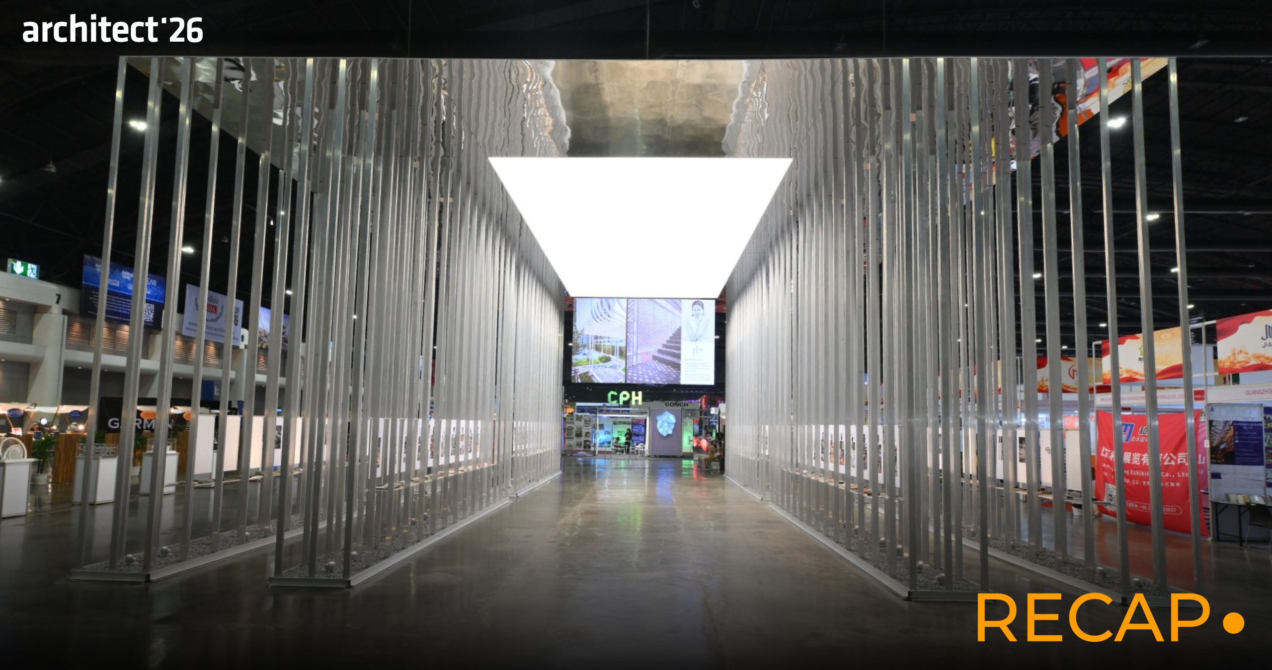
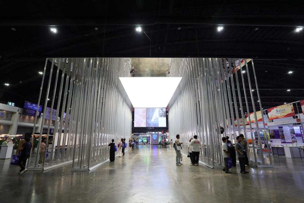
At Architect’26, Palette of Materials Pavilion made its debut as a new highlight zone that invited visitors to see materials from a different perspective.
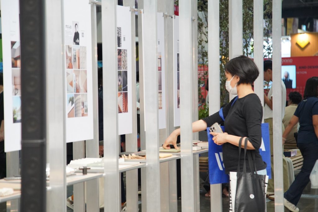
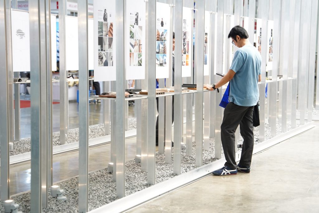
Traditionally, materials are displayed separately by product category and exhibitor booth. This pavilion reimagined the exhibition experience by encouraging visitors to explore materials through Mood Boards that brought together colors, textures, rhythms, and material pairings within a single context.
Throughout the exhibition, Palette of Materials Pavilion became more than a material display zone. It evolved into one of the first destinations many visitors chose to explore, including architects, designers, business owners, project developers, and design enthusiasts who wanted a clearer overview of the materials featured throughout the event and a more focused starting point for navigating the exhibition.
Featuring 80 Mood Boards created by more than 40 design studios using over 800 real material samples, Palette of Materials Pavilion demonstrated the diversity of material interpretation through the perspectives, design approaches, and visual languages of each participating studio. The pavilion served as a Material Directory, a source of inspiration, and an alternative way of presenting materials that connected visitors, designers, and brands.
The success of Palette of Materials Pavilion in its inaugural year was not defined solely by the number of Mood Boards or material samples on display. More importantly, it encouraged visitors to see materials as part of design concepts, creative processes, and spatial experiences, rather than simply as product samples.
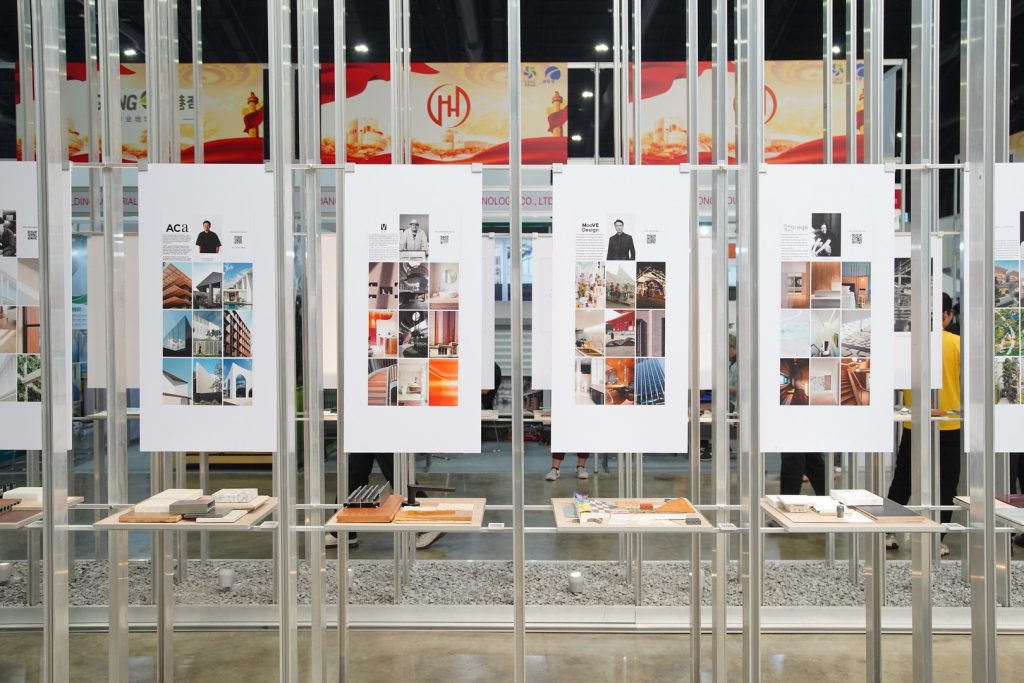
The following are the concepts behind the Mood Boards created by each participating studio, which together helped make Palette of Materials Pavilion one of the most noteworthy destinations at Architect’26.
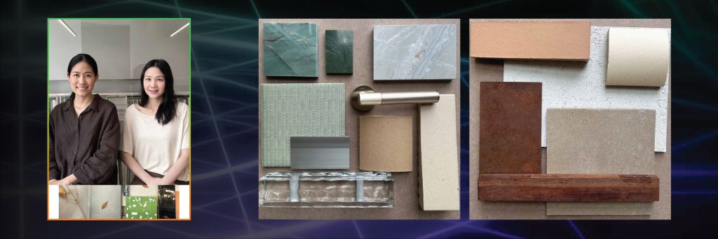
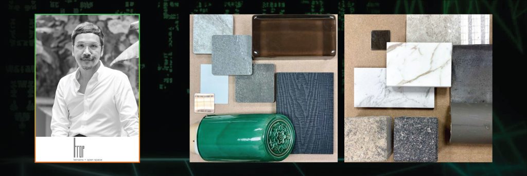
1. ACa Architects
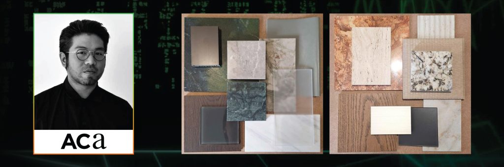
ACa Architects presented two distinctly different Mood Boards through contrasting color palettes and material textures. The first, titled Deep Forest, featured cool tones such as grey and deep green, combined with frosted acrylic panels and metallic surfaces to lighten the overall composition and create a smoother visual flow.
The second, Amber Earth, incorporated warm shades of brown, beige, and soft orange through patterned stone and wood, combined with corrugated tiles, tatami mats, and satin-finished glass to create a warmer and more vibrant composition.
2. Atelier of Architect
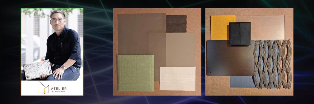
Both Mood Boards explored the idea that architectural materials exist between two opposing conditions: those shaped by nature and those carefully crafted by human intention.
One material originates from earth, sky, weather, the passage of time, and imperfection, while another is the result of design, control, and deliberate precision.
The strength of these Mood Boards lies not in choosing one condition over the other, but in the tension between natural rawness and human intention. It is within this tension that architecture moves beyond functionality to create emotional and sensory experiences.
3. ativich / studio
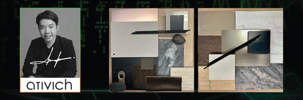
ativich / studio presented two Mood Boards that explored material tactility and the relationship between architecture and nature. Nature Within focuses on bringing nature into interior spaces through authentic surfaces and material honesty, creating tactile and experiential qualities within interior design.
Meanwhile, Natural Texture and Exterior Touch explores the experience of nature through the honest expression of materials, creating new architectural experiences through material authenticity.
4. ATOM Design
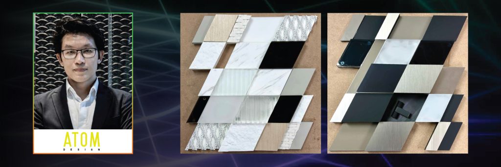
ATOM Design expressed two distinct architectural moods through concise material narratives. The first Mood Board highlighted the warmth of wood, the softness of white tones, and the texture of woven materials, creating a gentle architectural expression.
The second emphasized the precision of titanium, the depth of dark grey tones, and the mystery of black glass, resulting in a more seductive and intriguing architectural character.
5. B-YOND ARCHITECTURE
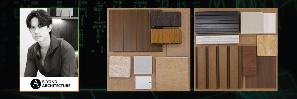
B-YOND ARCHITECTURE presented a tropical aesthetic refined into a modern, clean, and minimal expression, relying primarily on contrasts in texture rather than color.
The second Mood Board explored the combination of nature and warmth within a composition of darker-toned materials, using vertical and horizontal lines formed by aluminum panels and timber battens to create façade treatments with repeated yet engaging rhythms.
6. CONTEXT STUDIO
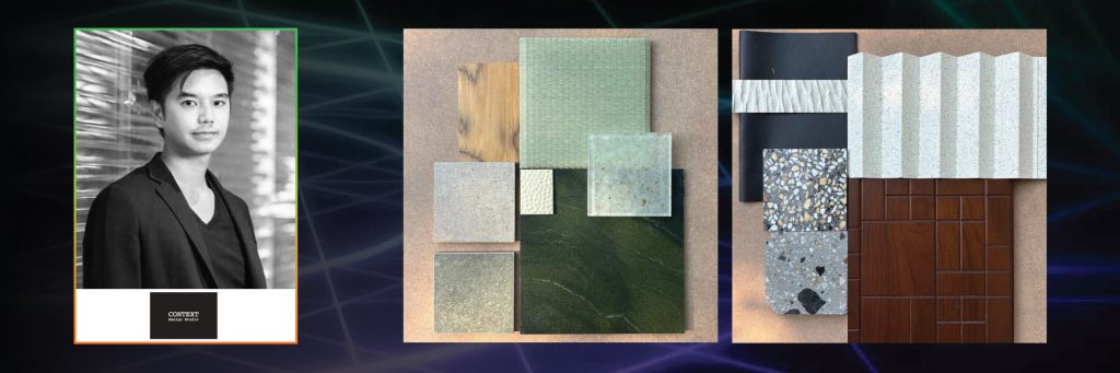
The Finding of Mindfulness explored the idea that amid the complexity of contemporary life, people seek spaces that allow them to reconnect with inner calm. The selected materials and color palette drew inspiration from Japanese philosophies such as Zen, Wabi-sabi, and traditional craftsmanship.
The second Mood Board, A Re-invention of Subtle Thai Post-Modern Materials Palette, reinterpreted terrazzo and fluted surfaces commonly found in Thai Post-Modern architecture alongside dark geometric wood panels and leather, creating a timeless sense of elegance.
7. Creative Territories
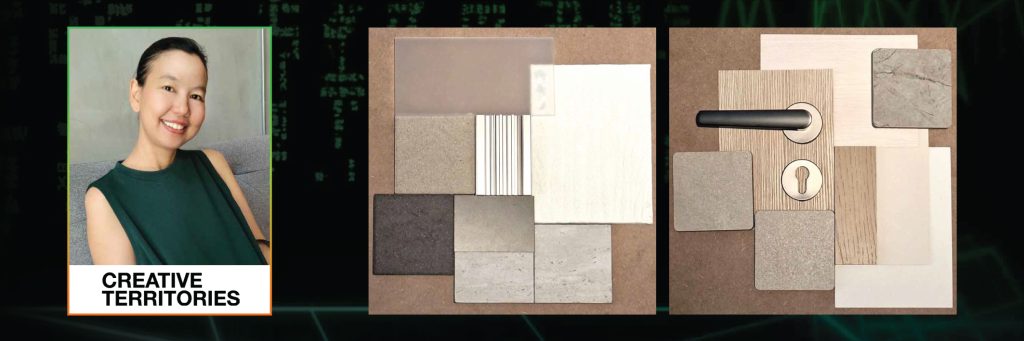
Creative Territories applied the concept of Warm Minimalism to both Mood Boards. The first explored a calm, grounded atmosphere through an emphasis on proportion, light, and materiality. Muted colors and textures softened the geometry of the space and contributed to a balanced environment.
The second focused on tactile and approachable simplicity through carefully layered neutral palettes that allowed material textures to emerge while maintaining a sense of warmth and intimacy.
8. DOUBLE V GROUP
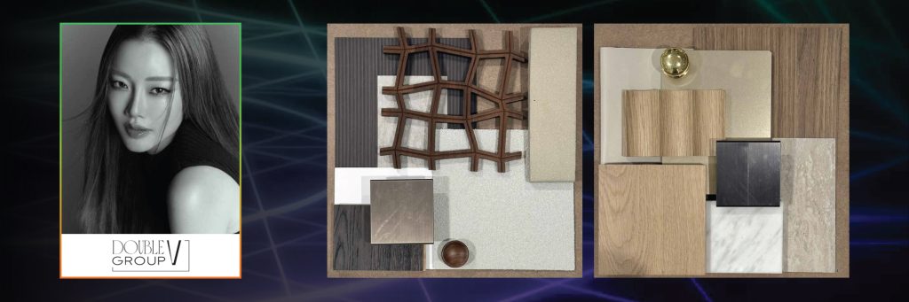
Textural Harmony explored the combination of wood materials, earth-toned colors, and layered textures, emphasizing differences in tactile qualities rather than bold colors.
The second Mood Board, Minimalism with a Touch of Luxury, paired nature-inspired materials with more luxurious finishes, including dual-tone timber, white travertine marble, gold-toned metallic surfaces, and beige accents to create a soft luxury atmosphere.
9. DUCTSTORE THE DESIGN GURU
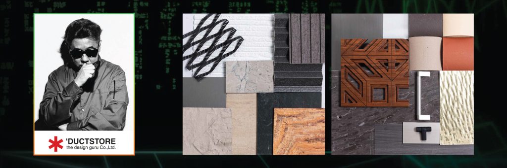
DUCTSTORE THE DESIGN GURU focused on patterns, lines, and material contrast. Both Mood Boards explored how contrasting materials can enhance architectural character and create stronger visual interest.
10. EKAR
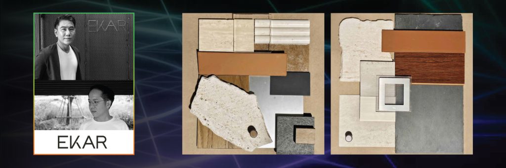
EKAR views architecture as the seamless integration of beauty and functionality through analytical processes that respond to the specific context of each project. Materials such as stainless steel, wood, and slate were selected for their distinct design identities and their relevance to the limitations and conditions of individual spaces.
11. GAPTHANAVATE

GAPTHANAVATE used the simple concepts of GREY and TRANSPARENT as the foundations of its two Mood Boards. The compositions and color palettes directly reflected the titles of each board, featuring dark grey tones in the first and lighter, layered transparency in the second.
12. HAA Studio
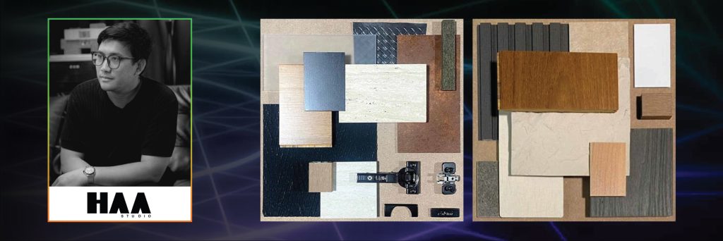
Modern Industrial Warmth explored the combination of raw metal elements and the warmth of natural materials, softening industrial characteristics through delicate details and the interaction of light with frosted glass.
The second Mood Board, Contemporary Earth Tone, combined natural color palettes with contemporary materials through shades of brown wood, dark grey, light grey, and white to create a simple yet contemporary atmosphere.
13. HAS design and research
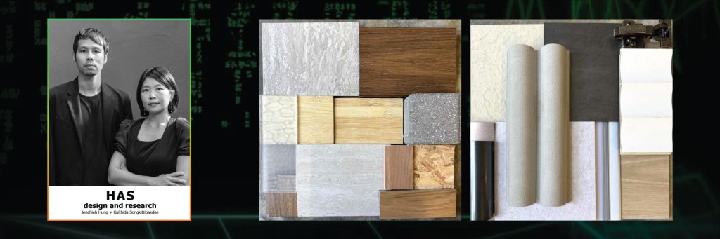
The first Mood Board by HAS design and research utilized natural tones that reflected the relationship between architecture and its environment through materials commonly found in both nature and basic construction, including grey stone, wood, concrete, composite materials, and translucent surfaces.
The second interpreted materials through an architectural language that is simple, direct, and honest to the inherent qualities of each material. Rough surfaces, metal sheets, curved forms, aluminum tracks, and metal hinges reflected a straightforward understanding of materials, structure, and fabrication processes.
14. Hypothesis
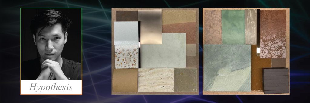
The first Mood Board expressed the identity of Hypothesis through a diverse body of work unconstrained by any single stylistic framework. Each project reflects a unique character shaped by the integration of the designer’s vision and the needs of its users.
The second Mood Board presented the studio’s identity through dark color palettes, brutality, aesthetic ugliness, and material honesty, while introducing a sense of refinement through leather and gold-toned stainless steel.
15. Inly Studio
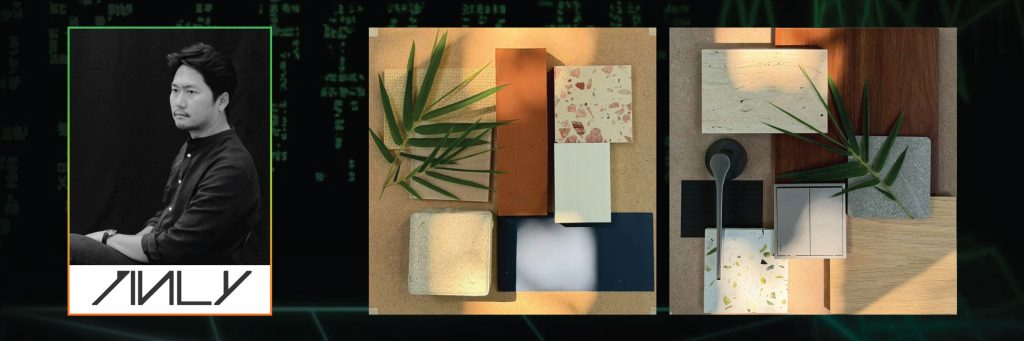
IInly Studio presented its first Mood Board through a warm palette inspired by exterior architectural materials such as terracotta, terrazzo, and soft natural tones, reflecting material honesty and authenticity.
The second Mood Board combined wood, stone, and natural finishes to create subtle contrasts in both texture and tone, expressing a design language that is balanced, understated, and closely connected to nature.
16. JUNSEKINO
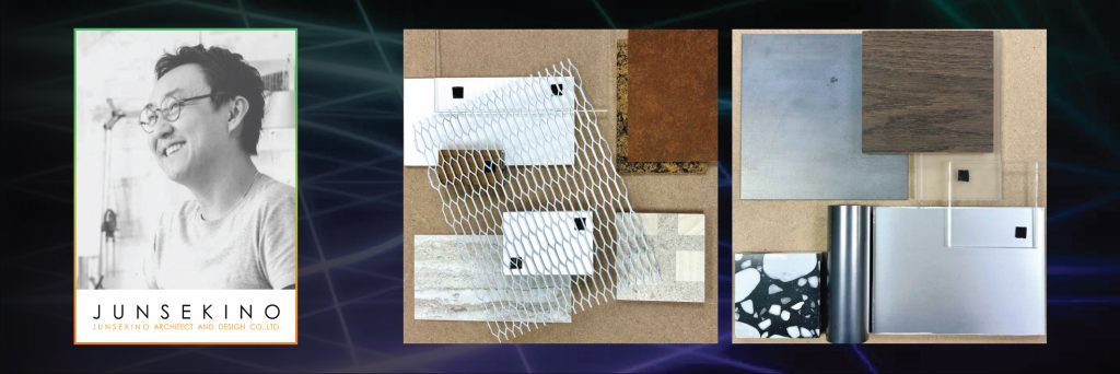
Earthy Modernism & Layered Light is the concept behind JUNSEKINO’s first Mood Board, combining the raw warmth of corten steel and timber with travertine and brushed metal. Translucent layers were introduced to add depth and a sense of lightness.
The second Mood Board, Harmony of Contrasts, balanced the industrial sharpness of metal with the warmth of dark timber. Terrazzo and translucent layers were incorporated to create a contemporary aesthetic for urban architecture.
17. LANA DESIGN STUDIO
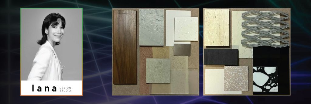
Earth-Toned Textures & Translucent Serenity explored the combination of timber decking, sand-toned surfaces, naturally veined grey stone, and frosted glass that softens and diffuses light.
The second Mood Board, Monochromatic Contrast & Vital Warmth, combined black-and-white patterns with perforated steel and warm orange textures, creating visual interest through contrasts in color and materiality.
18. Looklen Architect
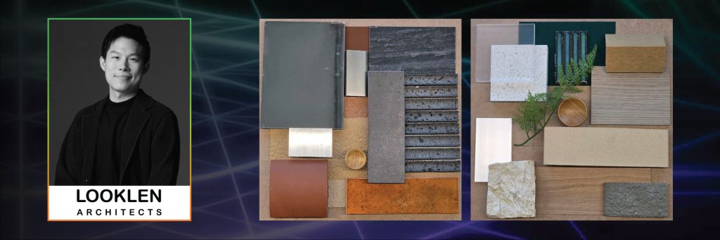
The first Mood Board by Looklen Architect was developed under the concept of “Refined Rawness,” selecting materials based on the idea of “living stillness.” Real surfaces and natural responses to light were emphasized. Concrete and stone provided a sense of solidity, stability, and calm, while metal surfaces reflected and received light, allowing the atmosphere to shift throughout the day.
The second Mood Board, Organic Modern Harmony, explored the integration of nature and contemporary architecture through curved forms, openness, and rhythmic composition. Materials including wood, stone, terrazzo, acrylic glass, textile, ceramic tile, metal, and greenery were combined to create a balance between natural warmth and modern refinement.
19. MooVE Design
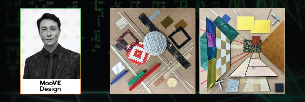
The first Mood Board by MooVE Design combined Eastern philosophy with Suprematism and employed AI as a tool for evaluating balance and visual weight. Inspired by the rhythm of Shoji screens at Katsura Imperial Villa, the composition was interpreted through a diverse selection of materials to create depth and visual dynamism.
The second Mood Board explored the relationship between Plane and Line through concepts such as Asymmetry & Balance, Contrast of Tactility, and Implicit Grid. Raw materials such as cork and circular elements were juxtaposed with refined materials including polished metal sheets and aluminum strips to create visual tension.
20. Mun Architect
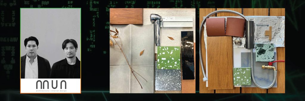
Mun Architect proposed that the harmonious relationship between engineering systems, architecture, and interior design, when conceived as an integrated whole, is a fundamental factor in creating aesthetic value and beauty in design.
21. Nitaprow
22. Physicalist Architects
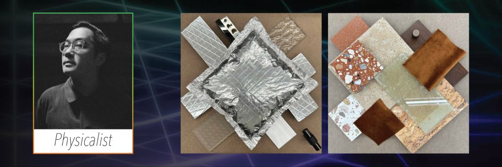
The Unseasoned is the title of Physicalist Architects’ first Mood Board, bringing together materials such as sound insulation, patterned glass, black stainless steel corner trim, and gloss metal knobs within a single composition.
The second Mood Board, A Study in Orange, featured three types of terrazzo alongside laminated glass, Amber Travertine stone, texture paint, solid teak wood, velvet curtains, and matte metal knobs.
23. PIORNI
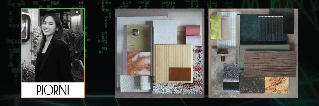
PIORNI expressed feminine energy through a Japandi-inspired composition using calm and natural tones. Materials included tatami texture, patterned fabric, coral pink accents, Breccia Damascata stone, transparent glass, Japanese paper texture, Hinoki wood, textile, and faux leather, creating an atmosphere that feels warm, delicate, and refined.
The second Mood Board emerged from a masculine vibe and energy, using dark wood tones and deep stone tiles as a foundation. Yellow-gold and deep grey natural stone introduced contrast and visual interest, while vertical lines and textured transparent glass created rhythm and spatial depth.
24. POAR
POAR explored the concept of tactile honesty through the juxtaposition of rough masonry surfaces with smooth timber and fluted finishes, creating a balanced atmosphere suitable for high-end residential and boutique commercial projects.
The second Mood Board emphasized material honesty through the use of solid wood and natural stone tiles, highlighting authentic surfaces and natural tones to create a calm and timeless architectural atmosphere.
25. pbm
Material as Medium of Light served as the shared concept behind both Mood Boards by pbm. The studio viewed light as moving before form becomes visible. Glass softens boundaries, wood introduces warmth, and mineral-based surfaces preserve traces of time. Together, these materials create a quiet dialogue between shadow and light, allowing space to be revealed gradually rather than defined in a fixed manner.
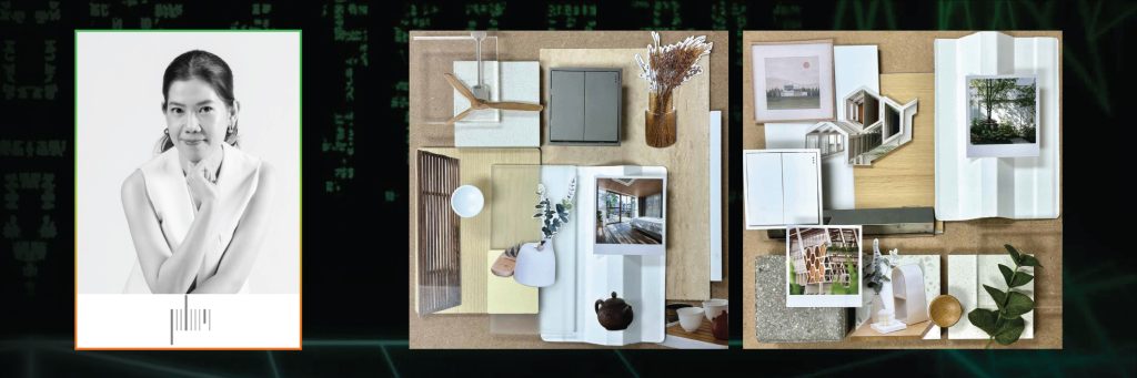
26. Sanitas Studio
Sanitas Studio presented the In Between series. The first Mood Board, Impermanence, explored material honesty as a space between humans and nature. Natural materials such as stone, wood, and rust conveyed traces of time, imperfection, and surfaces that evolve over time.
The second Mood Board, Reflection, explored a contemporary condition created through the combination of naturally occurring materials and intentionally crafted elements, including natural stone, glossy red acrylic, and reflective surfaces. Together, they form a space that reflects its surroundings, changes over time, and attracts attention.
27. SA TA NA ARCHITECTS
Warmth Within One’s Own Space is the concept behind the first Mood Board, proposing that warmth emerges through material tactility, light, and proportion rather than visual complexity. Soft tones, refined surfaces, and subtle reflections contribute to a sense of intimacy and calm in everyday life.
The second Mood Board, The Simplicity of Happiness, presents simplicity as an act of precision through reduction. Every element carries meaning. White tones and natural light create a peaceful atmosphere, while matte surfaces and subtle textures introduce an appropriate sense of depth.
28. Space+craft
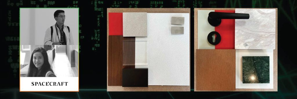
Space+craft explored an elevated approach to compact living through a timeless black-and-white palette. Materials were selected to reflect understated luxury while transforming limited space into a refined and highly functional living environment.
The second Mood Board reinterpreted Mid-Century Modern principles through vibrant personality and a lived-in sense of warmth. Clean lines, iconic silhouettes, bold color blocking, an eclectic curated feel, clean white surfaces, warm timber tones, and deep colors such as oxblood and cherry red were incorporated into built-in elements.
29. SPEC SPACE
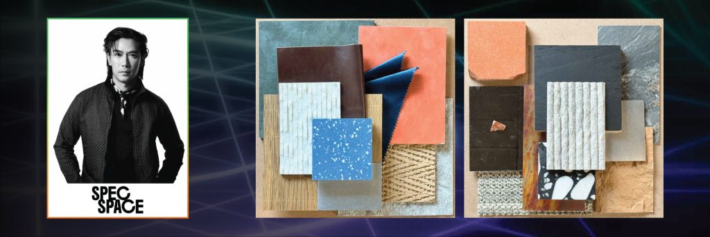
SpecSprem Cave Mancave is the concept behind SPEC SPACE’s first Mood Board, portraying a personal retreat for men with multiple dimensions of character, depth, and a playful appreciation for life.
The second Mood Board, Specspace Air-Chitecture, is built around the phrase “Heavy in Material, Light in Feeling.” Inspired by the SPEC SPACE pavilion at Architect’26, it explores the idea of making “heavy houses feel lighter.” Grey represents material honesty and the weight of architecture, while orange evokes the feeling of a seaside sunset and a sense of relaxation.
30. Storage Studio
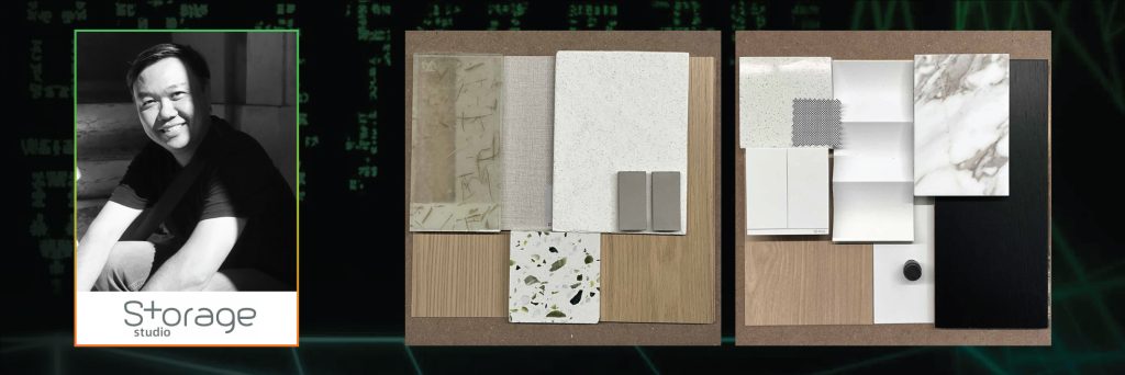
Storage Studio’s first Mood Board employed a neutral color palette that offers visual comfort and ease, complemented by green accents that introduce a sense of liveliness and relaxation.
The second Mood Board focused on white as the primary material color, using variations in texture, pattern, and light and shadow. Light-toned wood was combined with deep black timber accents to define and emphasize different areas within the composition.
31. Studio Krubka
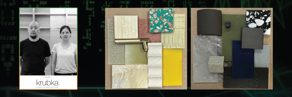
Soft / Playful / Interior is the concept behind Studio Krubka’s first Mood Board, expressing a warm, welcoming, and lively interior atmosphere. Natural materials are combined with translucent and reflective elements such as glass and metal, while a varied yet gentle color palette creates a playful and relaxed mood.
The second Mood Board, Dark / Brutal / Industrial, explores the mass and presence of architecture through an entirely dark palette. Rough textures reinforce a sense of honesty and material depth, creating a heavy, still, and distinctly industrial character.
32. Studio Locomotive
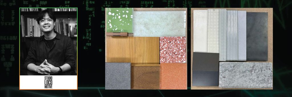
Narratives Through Materiality is the concept behind Studio Locomotive’s first Mood Board. It proposes that materials capable of evoking landscapes, climate, and craftsmanship play an important role in interpreting and creating dialogue with a designed space. Stories of local wisdom and regional identity can be expressed through indigenous materials or alternatives that closely relate to their context.
The second Mood Board, The Stage of Neutrality, explores raw materials in neutral tones enriched by complex textures. These materials help manage large-scale spaces or objects that do not need to assert a strong identity, instead serving as a backdrop for light, shadow, and other design elements to emerge.
33. STUDIO MITI
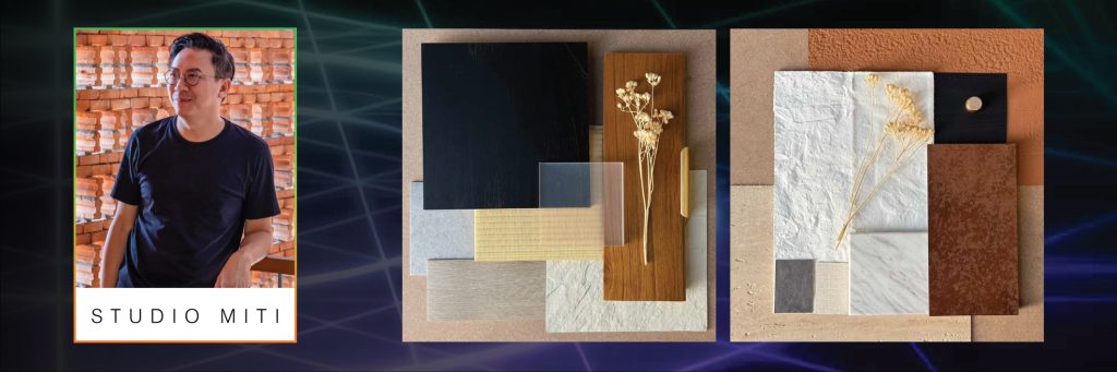
STUDIO MITI applied the same concept to both Mood Boards: a layered structural arrangement that progresses from the ground upward, creating different perspectives and spatial perceptions according to each environment.
34. Studio PATH
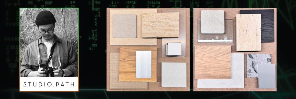
The first Mood Board explored a simple combination of materials. Although contrast is present, every element is carefully controlled and kept in proportion, allowing the overall composition to remain balanced and cohesive.
Materials in Balance is the concept behind the second Mood Board, bringing together warm wood, cool stone, and soft metal to create an atmosphere that feels quiet, grounded, and steady.
35. stu/D/O
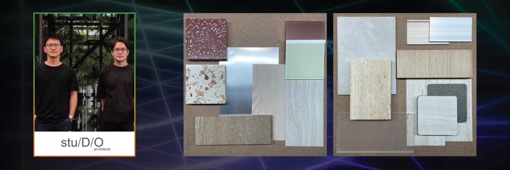
stu/D/O combined natural materials with subtle color accents to create visual focal points without disrupting the overall calm and gentle palette. Smooth surfaces are paired with more expressive materials to introduce depth within the space.
The second Mood Board featured neutral finishes with natural tactility and subtle variations, accompanied by translucent layers that soften the diffusion of light while creating depth and spatial hierarchy without visual noise.
36. TPDesign and Development
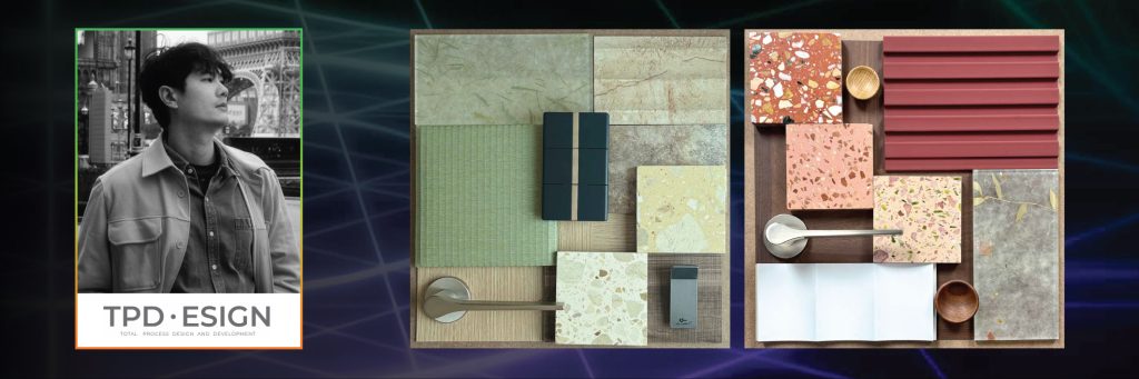
TPDesign and Development explored the Japandi concept through a balance between Japanese serenity and Scandinavian warmth. Muted green, light wood, soft beige, and natural stone tones were paired with woven textures, organic terrazzo patterns, light timber, and brushed metal to create an atmosphere that feels calm, warm, and timeless.
The second Mood Board reflected a Modern Mid-Century approach through a balance of warmth, tactility, and refined simplicity. Walnut wood served as the foundation, complemented by muted brick, dusty rose, and soft sage-grey tones, together with organic terrazzo patterns, fluted surfaces, and lightweight translucent materials. The result is a space that feels warm, sophisticated, and timeless while maintaining the distinctive character of mid-century design.
37. TROP
Nature Meets Refinement is the shared concept behind both Mood Boards by TROP, expressing compositions that connect natural qualities with contemporary refinement.
38. Unknown Surface Studio
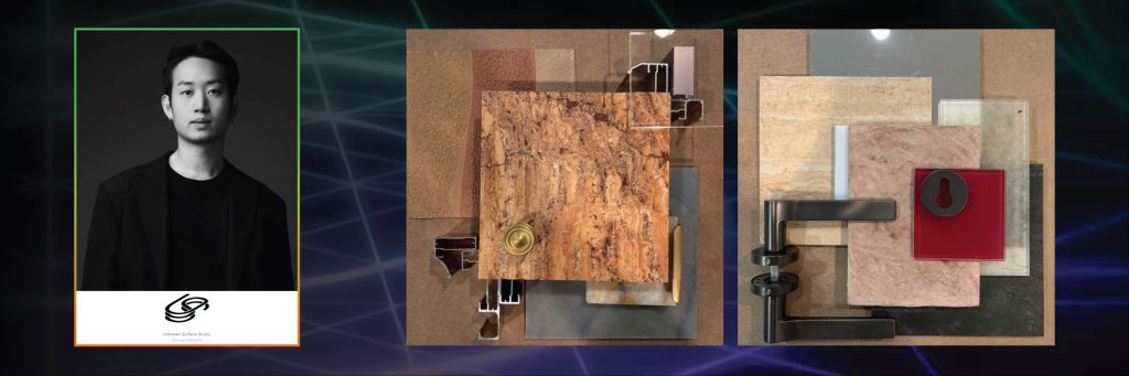
Refined Contrast is the concept behind the first Mood Board, exploring a dialogue between softness and precision. Warm-toned stone surfaces and muted earthy colors establish a tactile foundation, while metal hardware and translucent glass introduce a clear modern expression, creating a balance between warm minimalism and quiet sophistication.
The second Mood Board, Layered Earth, expresses depth through layered materials, organic stone patterns, and textured surfaces that evoke the beauty of geological formations. Metal profiles and clear acrylic elements are positioned alongside these materials to reflect the relationship between the imperfections of nature and human precision.
39. Volume Matrix Studio
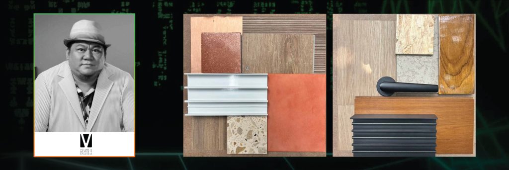
Volume Matrix Studio’s first Mood Board reflects a sense of calm and intentional design through a restrained material palette used consistently throughout a project. Smooth plaster and matte concrete form a stable and understated backdrop, while warm timber and softer materials are introduced selectively to create warmth and a more human scale.
The second Mood Board explores the idea that spatial beauty is experienced not only through sight but also through touch. Each material possesses its own texture and characteristics, shaping different perceptions and experiences of space. Materials therefore become more than decorative elements; they are part of the lived experience of architecture.
40. Walllasia
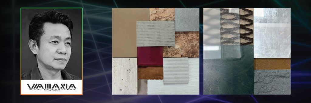
Walllasia’s first Mood Board proposes that although materials may possess distinct identities and textures, they can coexist harmoniously when arranged with respect for their diversity.
The second Mood Board is based on the concept of Material Honesty, reflecting Walllasia’s appreciation for materials in their true state and their natural transformation over time, allowing each material to reveal its character through the passage of time.
And now, prepare to experience Palette of Materials Pavilion once again at Architect’27.
This unique showcase offers building material brands and designers an opportunity to connect, exchange ideas, and present their perspectives on materiality through a dedicated exhibition platform.
Be Part of Palette of Materials Pavilion
Reserve your exhibition space for Architect’27 at: https://architectexpo.com/space-reservation/