Recall the previous Key Visuals of the Architect Expo before the up-coming release of Architect’23!!
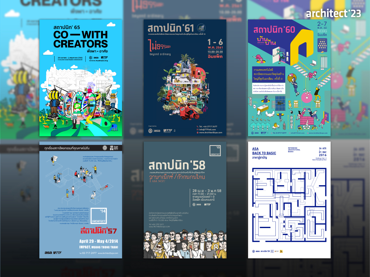
Every year at the Architect Expo, there are various Key Visual concepts based on the year’s stories, situations, outlook or global social trends. Every year, there are always hidden tricks that genuinely satisfy visitors with the fun of several activities and innovative booths that are always changed.
The Key Visual concept of Architects’23 will be released in the coming months. Today, we’ll look back at the history of Key Visual concepts introduced by the Association of Siamese Architects under Royal Patronage (ASA) each year. What exactly were the activities? How much fun did they have? What were the biggest surprises each year? Let’s explore!
Architect’14: Eighteenth | Eighty
“Daily routine pictures reflect the image of an Architect:
Employ everyday activities of ordinary people to communicate the roles and duties of architects to the public.”
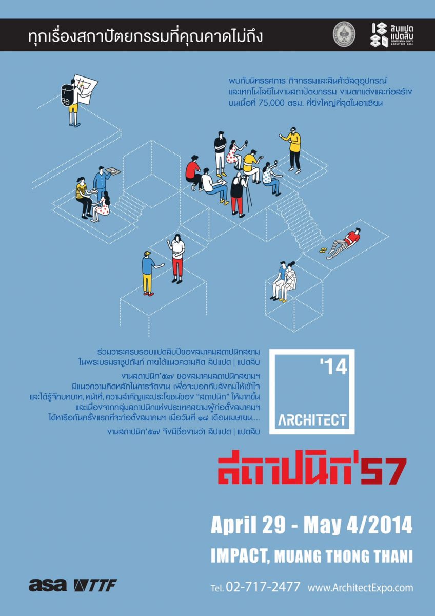
Key Visual concept of Architect’14 was presented through simple lines but clearly in reflecting the activities that people generally associate with architecture in the dimension of daily life.
Thus, we can see people and structural lines of various buildings that link back to the relationship to architecture, which is the role, function, importance and benefits of “architects”.
LOGO CONCEPT
Simplify the exposition format while creating the connection to the main concept by focusing on “the space between the position of 18 and 80″ which refers to the period of 18 (the number of the tertiary period and the date of the association’s founding) and 80 (the anniversary of the association)”.
To represent a link between people and building space, the logo was designed by combining a square shape with an isometric structure.
Architect’15: ASA Next | Thai Uniqueness
“Any changes must be initiated by us”
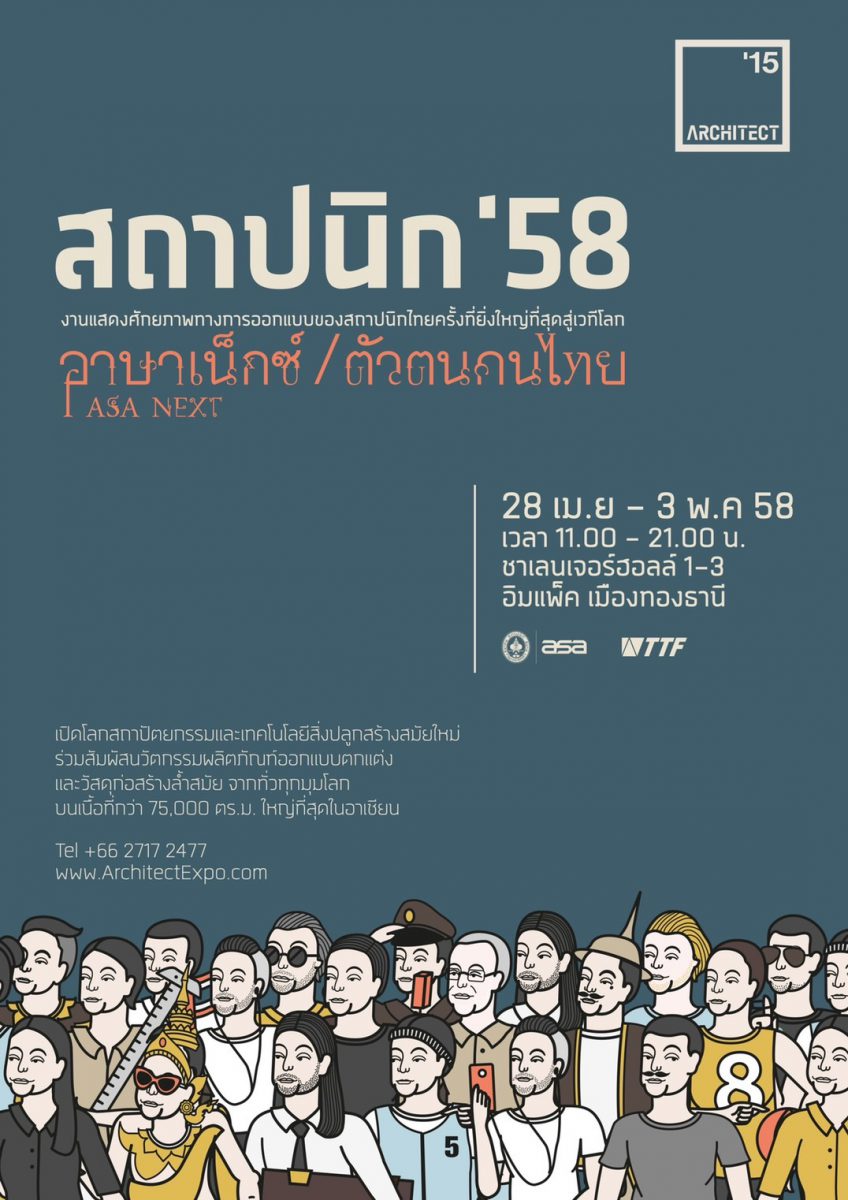
Thailand was in the midst of a major transition that affected “people” in every region at the time. As “Architects” who were a part of this transition, we asked ourselves if our potential was sufficient for the change. So how could we know what level we were on?
If you believe that Thai architects are remarkable in many aspects and have standards that are equal to or higher than those of many other countries, Architect Expo will be a good public relations platform to the world stage, creating a space where everyone can participate in and show their work performance, as well as compare and learn from one another’s works.
In 2015, the Architect Expo was transformed into a must-visit platform for all Asian architects, with Thailand serving as the focal point to demonstrate the potential of architects and collaboratively develop their design abilities. This is not only for Thai architects, but also for those from Southeast Asia, with the goal of Architect’15 displaying “Thai Uniqueness.”
Architect’16: Back to Basic
“Present the basics of architecture for better public perception”
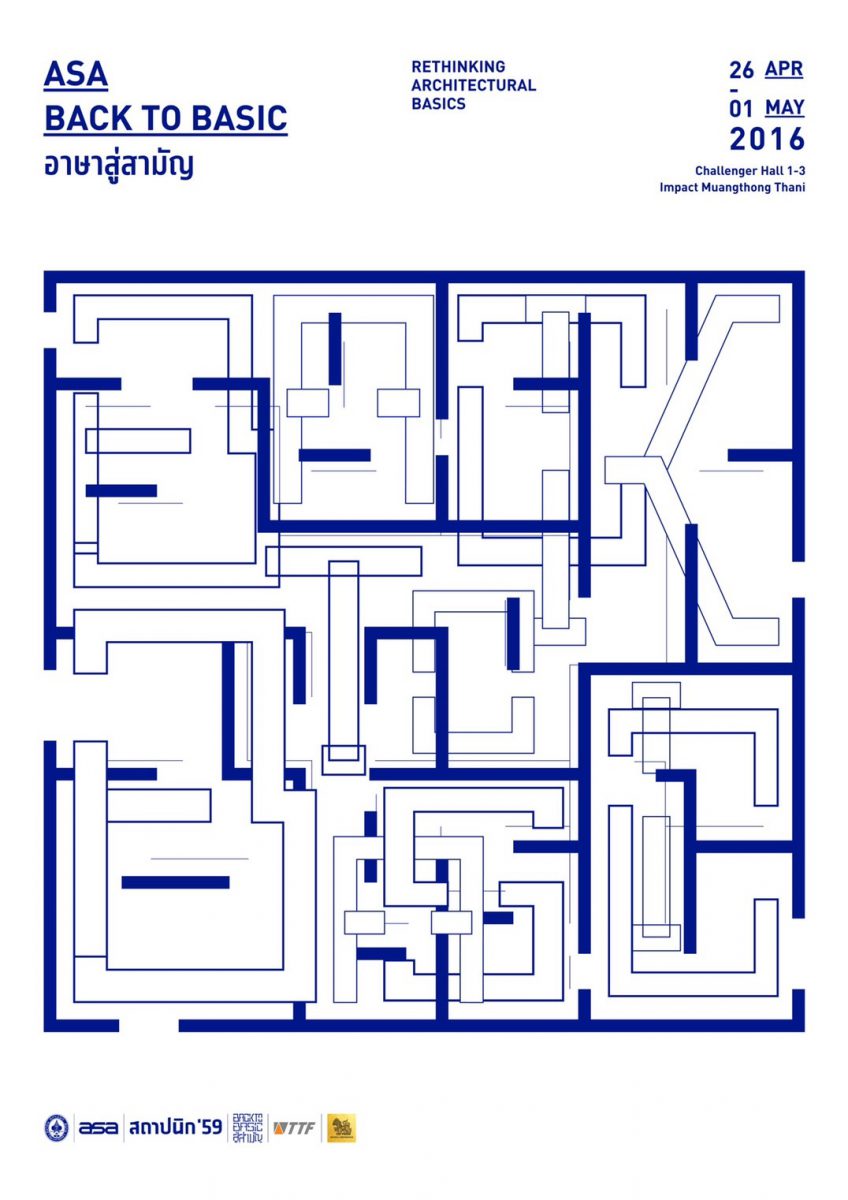
Architecture is the functional design of a space. When designers look back at the basics, they will realize that “drawing style is the fundamental that allows people to understand and make architecture happen”. There’s a lot hidden in those drawings if you look carefully.
Thus, we took those elements and developed new typefaces based on architectural plans that show line weights as circulation, wall, and void. These could be developed into diagrams with positive or negative spaces and elements that would then be developed and sketched into new Key Visuals.
Each Key Visual had its own diagram process, allowing people to understand that the Basics of Architecture which could be developed endlessly without a fixed pattern, in line with the theme of Architect’16.
Architect’17: BAAN BAAN Reconsidering Dwelling
“Because ‘house’ is the first fundamental architectural form where everyone lives and in which each day begins and ends.”
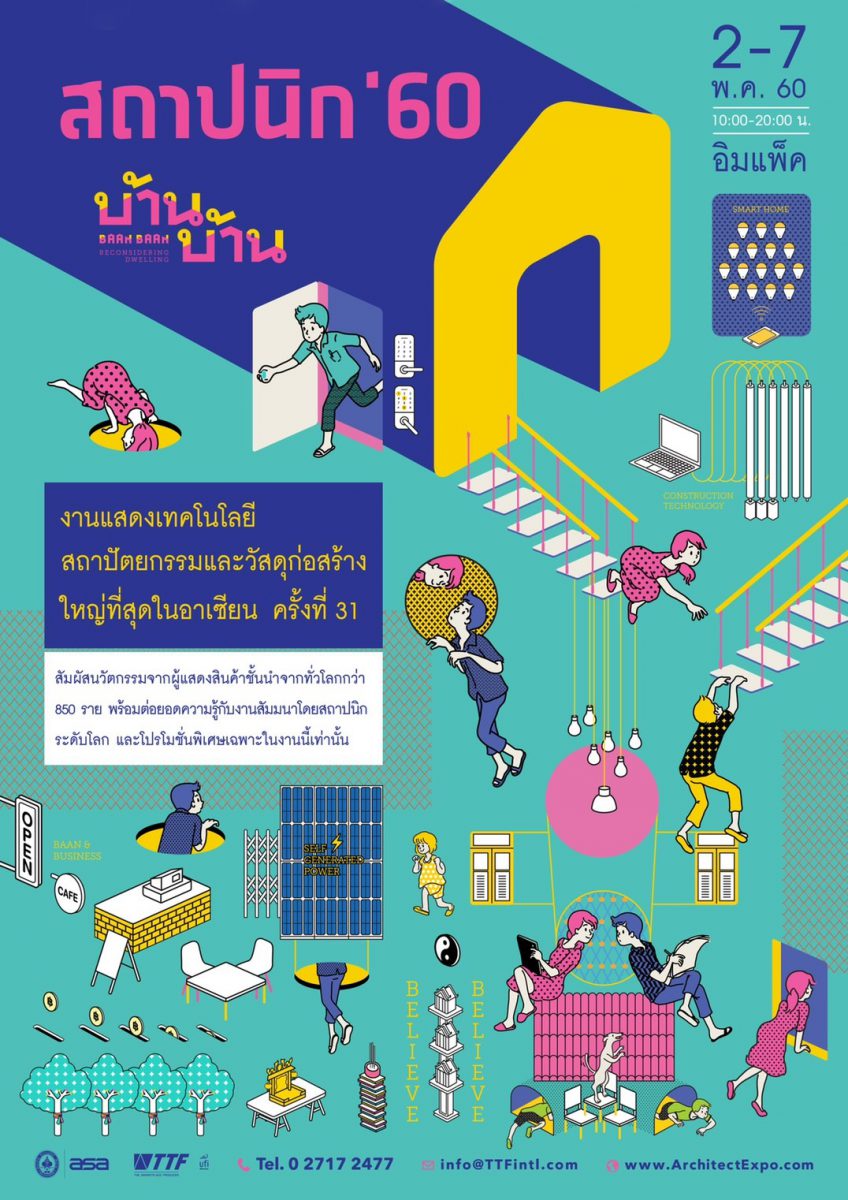
“House” can serve more purposes other than residence. It can be converted into some other functions, such as an office, restaurant, cafe, or even a hotel. With house controlling devices, smart appliances, and construction technology, newly developed technology makes our homes smarter. The complexities of beliefs and cultures are all new meanings of a house.
When the traditional house had to be combined with changing behavior and innovation, this was a factor that heightens the meaning of the word “home,” as if it were a plug-in in a computer program that broadens the capabilities and scope of living.
Eliminating the traditional meaning of the word “house” and thoroughly reconsidering it in order to build a new “house” to be more responsive to modern life.
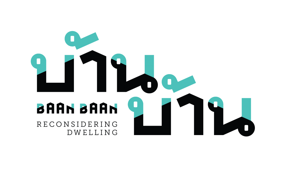
LOGO CONCEPT
The letters of the word “Baan Baan” have an important characteristic. A 24-degree diagonal line drawn from the Thai vowel “ah” cuts the Thai letters “Bor” and “Nor” as a roof line, resulting in the shape of the house in the alphabet, which are Thai characters with headers. The letter headers have spaces in a square shape, which is the opening style representing the house’s door or window that was used to create the symbol’s uniqueness.
Besides that, the letter header selection reflects the meaning of local, simplicity, or the local Thai style, which is one of the meanings of the word “Baan Baan”
Architect’18: BEYOND ORDINARY
“Pa-pa Po-po, a definition of problem solving in Thai ways”
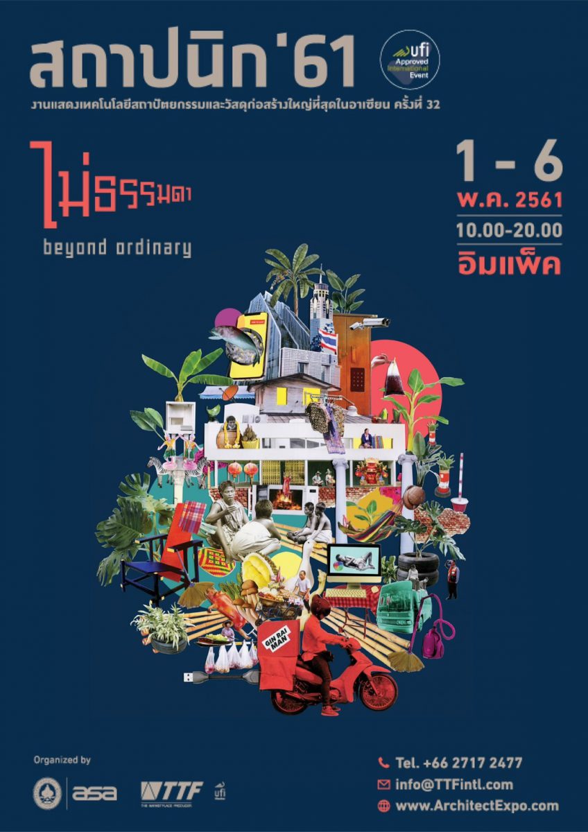
When Thais face problems, they usually come up with hundreds of thousands of creativities to solve immediate problems, which have eventually evolved into their effective problem-solving skills.
However, the creativity used to solve those problems had a negative impact as well. The source of the problems could not be identified and addressed in a systematic manner. Thus, Thai lifestyles are extremely complex in many ways. And it’s becoming more complicated by the day.
Collage was therefore an artistic expression that portray a clear picture of the Thai way of life, which appears complex but has hidden messages to be explored.
LOGO CONCEPT
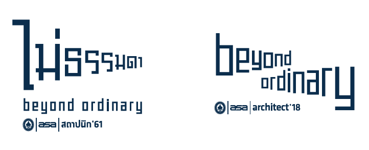
According to folk wisdom research to solve everyday problems, one of the impressive studies is “Temple Fair Signboard,” which separates each word so that fast-moving vehicles can get the message that the organizer wants to deliver.
This results in the “Extraordinary” logo design idea with a perspective look that gives a sense of movement. It could be interpreted as moving forward to the future or backward to the past, based on the content of Architect’18, which focused on researching traditional wisdom in the past, as well as local architecture, and wisdom in adapting things to Thai people’s way of life to prove whether or not they could be able to cope with the changes in the future that will be changing rapidly.
Architect’22: CO – WITH CREATORS
“Co-creation is a source of the more effective work performance”
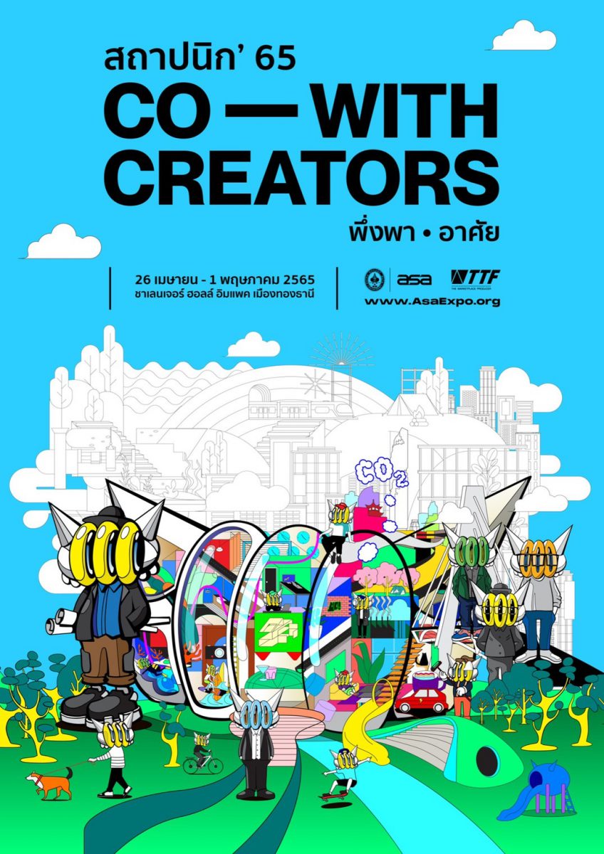
The main concept was to pick up the architecture that uses the design process in a “co-with creators” style, because of the attractiveness of the design process in a way of “co-creation” from different professions, such as collaboration between architects and landscape architects, artists, light designers, fashion designers, photographers or designers in other related fields.
The Key Visual of Architect’22 was created by a street artist, BENZILLA. The Three Ball, which appears in every element, is the main character and Living Space is the key header. When you look closely at the lines and patterns, you will notice that it is representative of people in the city with various lifestyles while displaying contemporary in a way of planting trees, listening to music, raising animals, working, cycling, surfing, skating, and so on.
Overall, the Key Visual for this year was very artistic. It exuded the vibe of street art. Most importantly, it reached a broader range of people, including new targets and street art groups. This motivated them to seek solutions to this Key Visual at the Architect Expo.
LOGO CONCEPT
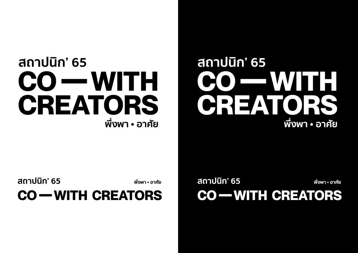
“Simple, easy-to-read, and best understandable.” The LOGO did not need to be too flashy due to the colorful and pattern-filled key visual. Because the designer did not want to compete with the main Key Visual, the LOGO is kept simple. For the font, we choose the same design as the high-end brand style “Box Logo.” It looked cool when it’s on a shirt. Whether you use a one-line or two-line format, you know what this exposition is.
It is a very exciting time for the upcoming Architects’23 because it is the 35th anniversary of the Architect Expo. The Association of Siamese Architects Under Royal Patronage (ASA) are now recruiting key visual designers for this year’s exposition. Please wait a little longer. You will soon know who will create the Key Visual of the Architect Expo’s 35th anniversary.
For those who are interested in space reservation, please visit our website at https://architectexpo.com/2023/en/about-the-expo/#space-reservation or contact us at 02-717-2477 and Email: [email protected]
See you at Architect’23 during 25 – 30 April, 2023 at Challenger Hall, IMPACT Muang Thong Thani.


