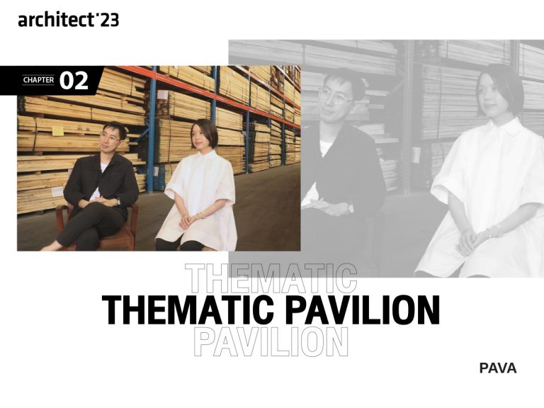
THEMATIC PAVILION: DEBUT THE HYPE ART PIECE FROM HYPOTHESIS AT ARCHITECT’23
Hypothesis, questioning, unconventionality have always been the signature in the design of ‘Hypothesis’.
Whenever the name of this studio appears at any events, it is always guaranteed that visitors are in for an exciting ride as Hypothesis always delivers the boldest design. Upon seeing the name of Hypothesis as one of the designers for the Thematic Pavilion, presenting materials from 2 leading brands, TOA and VG, many, including us, are looking forward to discover “what will the studio play with this year? How would they present the material?”
If you think that by featuring TOA, a leading brand of color materials, and VG, which also has color products in their line, the design for pavilion must be bold and colorful, however,
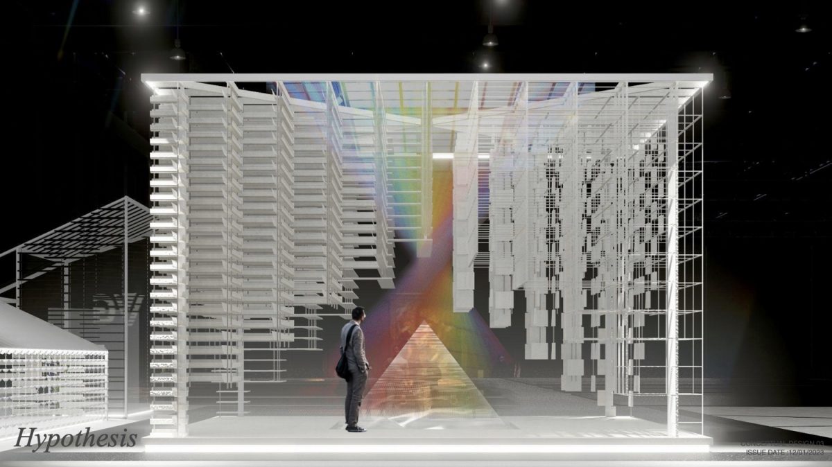
this year’s Thematic Pavilion is white.
If you think that Thematic Pavilion’s design must focus on showcasing the durability and functionality of the material, this year’s Thematic Pavilion features various effects, giving a dazzling vibe as if the products are a work of art.
“If you see the design and go ‘is this really at Architect’23? Why is it such a strange sight? Shouldn’t something like this be at an art event?” We might have to ask ourselves a new question. “Why would this not be at an architect event, when they made it happen?”
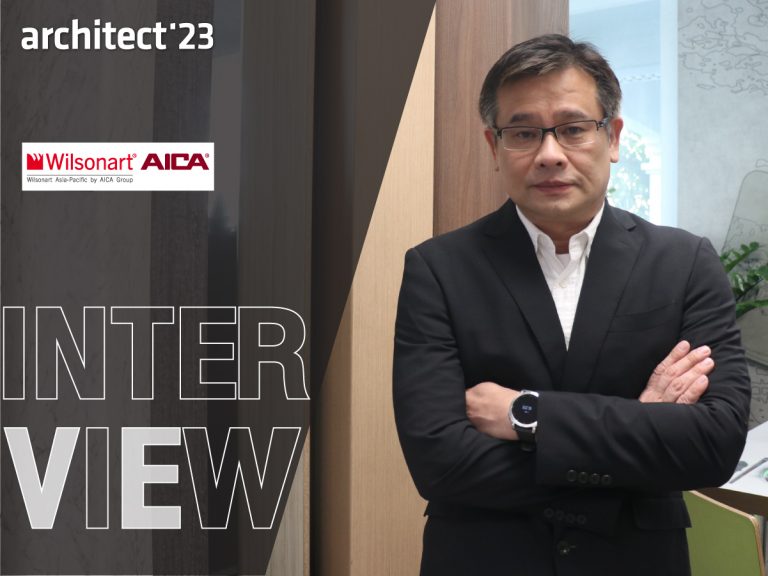
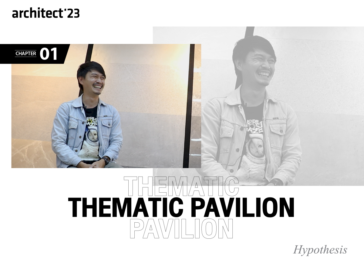
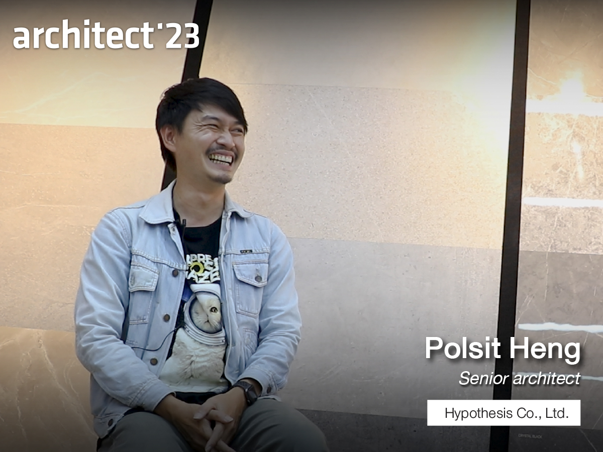
Let’s delve into the origin to this concept together. Today, we are talking to the minds behind this piece of design from Hypothesis, including Khun Pol – Polsit Heng, senior architect, and Khun Ben – Jattarin Sungsuman, architect.
2 BECOME 1
First of all, for 2023, only this Thematic Pavilion features products from two brands and shares the exhibition space. Consequently, the position and design of the pavilion must be balanced, not biased, not overpowering one another and must achieve all desired goals.
“We have to combine the two brands together without making them overpower each other. There must be a balance in the center of the space. The booth must be dynamic and showcases the products of both brands as well. In the end, the difficulty is to make them blend together.”
From the concept, after processing all data, together with design planning and meetings to develop the design according to their words. We have summarized the key words of the design as 5S as follows:
symmetry / symbolic / sensory / synchronized / sustainability
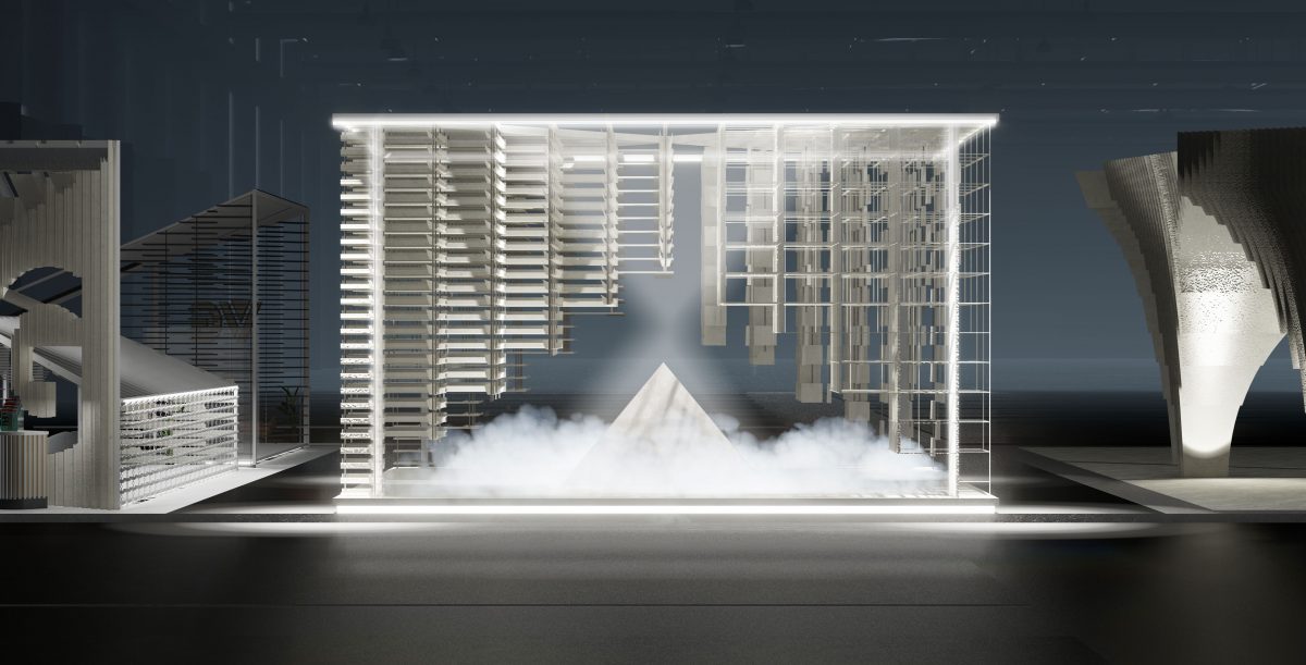
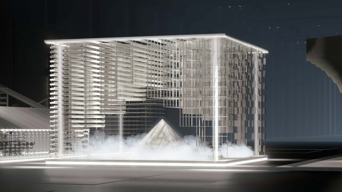
- Symmetry: In terms of space design, Hypothesis uses the space for Thematic Pavilion in a square shape that is neither too long nor too short, by locating it in the middle position between the TOA and VG product booths. When seen from outside, the design looks harmonious. Upon closer inspection, however, the area is symmetrically divided in order to meet the functions in terms of being a showcasing space and a journey for visitors.
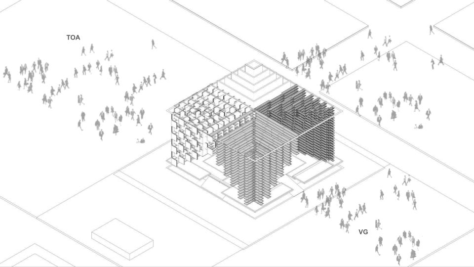
To put it simply, the space is designed to be divided into 4 nodes with a passageway that crosses into a + shape. If you draw a vertical line across the center of the pavilion, all the design materials installed on the left side are from the exhibitor booth on the left side, while all materials in the right side of the space features products of the exhibitor from the right side. Such design can meet the functions in terms of both the journey of visitors and product exhibition.
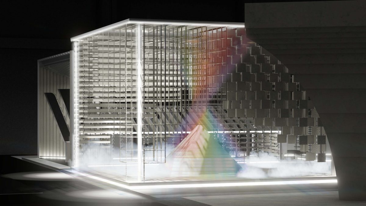
- Symbolic: Why is there a pyramid and spring located at the center of the Pavilion? This will probably one of the questions that everyone has. The origin of this symbol comes from the elements that TOA and VG have in common. Both brands feature upstream process in their production, thus such idea is communicated through the stream emerging from the top of the glass pyramid.
“The upstream element comes from the fact that after discussion, we feel that both brands manufacture their own products and have their own resources. Upon receiving feedback, they often take the suggestion to develop new innovations for customers. The top of the pyramid with flowing stream is symbolic of being the source in the same way that both brands are initiators, so we feel that the upstream element reflects both of these meanings.”
- Sensory: From the design model which introduces lighting effects, smoke and spring into play to create a dynamic atmosphere and to communicate the concept clearly.
“We wish the booth to be as dynamic as possible. And when we talk about the upstream concept, it conveys nature. The water which we use, lighting or even smoke all play a part in visualizing the word nature. We wish visitors interpret the scene by themselves. We do not tell them how to interpret the elements; we will not have anything labelled. We just wish visitors to enter the space, take in the atmosphere, take photos, experience and interpret the design by themselves.”
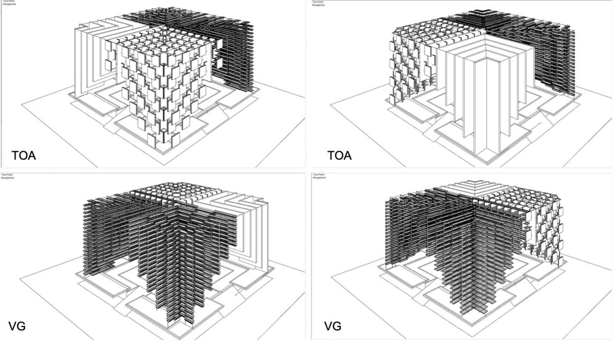
- Synchronized : : After the concept is concluded, the next process is selecting materials to use in the design to achieve a harmonious and consistent finish. Hypothesis chooses products with elements that are similar in shape and color and arrange such in an interesting way as follows:
The linear shape of pillars: on the VG side, Hypothesis selects iR-uPVC gutters and innovative roof, while the 2 pillars on the TOA side features C-shaped gypsum wall-framed products and tiles from TOA.
Hypothesis decides to go with the color white for the design. In addition to being a neutral color which is common in the materials of both brands, the color also balances the overall design of the Thematic pavilion, not complimenting one brand over the other. (If the design is colorful, it may lean toward the TOA products. The use of white color also prevents the pavilion from standing out too much because the exhibitor booths sandwiched on both sides are colorful in the design.)
“The materials that we selected are actually quite difficult and challenging for us. TOA has a wide variety of materials and VG itself has a lot of materials. We used criteria to select the materials that represent the lines that both had and designed in a way that the overall appearance goes well together in the same direction. Then we try to explore which type of material will have the best effect and factor in the installation aspect.”
- Sustainability : All materials used in this event are installed and designed while considering sustainability, they can be re-used after this event ends. Materials selected are resistant to effects, steam, smoke and feature mounting methods that protect the material. More than 90% of the pieces can be removed for re-use. The damaged remnants can also be recycled into a new material. Such viewpoint on sustainability comes from the joint planning with TOA and VG, who recommended the use of detachable mounting method, rather than drilling.
Lesson Learned
Hard to SAYS ‘DITTO’
What have you learned from this collaboration with the two brands?
“We have learned that it is very difficult. Difficult here is in terms of design, data, especially negotiations to get approval from all parties. Normally, when we embark on a project, there is only one customer, the negotiation is a lot simpler. When there are 2 customers… for comparison, it is like designing a house that is owned by both the husband and the wife,
sometimes one party does not like the chosen element. We act as a mediator by delivering the comments from both brands to the other. Meeting time is like holding a family gathering to discuss the details again. The difficult part is the fact that we have to process the data received to ensure that balance is achieved and not giving too much weight for one particular side. Otherwise, we would never get the approval from both customers. We feel that the hardest part was the data and negotiations on all three parties, which I have to say went pretty well.”
Even with the difficulty in finding balance, this kind of open collaboration encourages a fun creation, which is the origin of what we will witness.
“We have been quite fortunate because both customers are open-minded. Since the first briefing, we propose that we want to play with the materials. Both customers allow us to experiment with the materials right away, like use them in an unconventional way, play around with them a bit more abstractly. So we took that and experimented by rearranging the materials.
However, we do not want to go overboard and transform the product completely. For instance, if we turned the gutter into something unrecognizable, we would not see the need to use a gutter, we can use another product instead. Our goal is to rearrange that material in an interesting way, while making sure to emphasize its use.”
Your Place, Your Experience
“For the Thematic Pavilion, Hypothesis have tried our best to communicate the information we received for visitors who attend the event to interpret. We wish visitors to experience, try to play with the products, and try to interpret the design and see if their interpretation is the same as what we’ve communicated.”
Upon hearing an invitation from Hypothesis, visitors are welcome to attend and enjoy the experience at Architect’23 “Tum Tad: Time of Togetherness” to be held during Tuesday 25 – Sunday 30 April 2023 at Challenger Hall, IMPACT Muang Thong Thani.
You know this event should not be missed!